HABITAT FOR HUMANITY
02/2024 - 03/2024
An intuitively usable responsive website for the humanitarian organisation Habitat for Humanity with a community portal to connect with volunteers and projects.

Practice Redesign // UX Design // Social Design
02/2024 – 03/2024
Role: Research, Ideation, Conception, Design, Prototyping,Testing, Rendering, Community Design, Logo Design
Project Overview
Facing global crisis, like climate change, global wars, mass displacement and financial difficulties, housing is increasingly needed for affected people all over the world. Habitat for Humanity is an organization that provides affordable homes all over the world. Looking at the users, we can identify pain points with confusing donation pages, intransparent volunteering pages or difficult interaction with the organisation itself.
The Goal of the project was a responsive website with a community page and easily accessible project search functions.

User Research
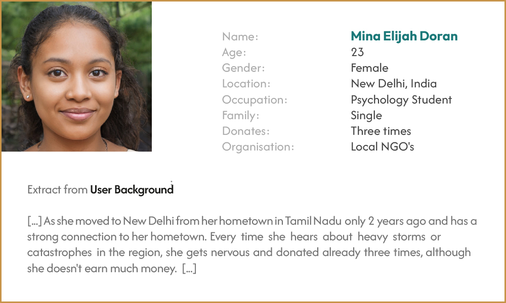
I conducted user interviews, which I then turned into empathy maps. I discovered that many target users wish to share projects and keep track of the project stage. This resulted in a focus on the community aspect of the project.
Pain Points
1. Usability: The current website is really busy and text-focused.
2. Functionality: The interaction between users and organisation is not given.
3. Transparency: Many users wish for more transparent processes and information.
User Journey Map

Information Architecture, Wireframing and Prototyping
The third phase of the design process involved designing the Information Architecture of the web page, conducting ideation exercises (Crazy-8's and How-Might-We-Questions), sketching paper wireframes, translating them into digital wireframes and creating a Low Fidelity Prototype to test with potential users.

↘ A pain point for users was about the functionality of websites for humanitarian organisations and the lack of interaction with the organisation itself. I wanted to implement the user as a part of the organisation itself by allowing to share and comment, creating content and accessing information transparently.

↘ Creating paper wireframes, I was able to generate multiple ideas for the website. The page needed elements like a hero image, navigation buttons and a top navigation bar, highlighted projects, a community side bar and search functions.

↘ With users accessing the website across a variety of devices, it was essential to create variations of the wireframes for mobile and tablet use to ensure the responsive website was useful.

↘ Switching from paper to digital wireframes made it easy to understand how the redesign could help solve users' problems and improve the user experience. Prioritising useful buttons and the placement of visual elements on the homepage was an important part of my strategy.

Low Fidelity Prototype
For the Lo-Fi prototype, I created multiple screens to expand the range of possible interaction and connectivity. My goal was for the testers to explore the prototype and achieve the goal of the usability study through different approaches.
Low Fidelity PrototypeConducting Usability Studies andtesting the prototype led to importantinsights, which helped to refine thedesign and increasing its usability.


Refining the Design and Prototyping
After conducting the first usability test, I fixed the issues and improved on layout designs and accessibility. Now I created the visual identity and redesigned logos, icons and selected colours for the different functions of the app. Through visual principles, layout techniques and functionality optimisation, I created the high fidelity prototype.

↘ Throughout the process, the design and layout of the website went through several iterations until settling on the final layout of the website that allows users to navigate easily and efficiently.

↘ The sticker sheet helped identify the various design decisions and parameters. I chose a font combination of a bold sans serif headline and a more delicate sans serif font for the paragraphs. A complementary colour choice helped to distinguish the features on the website.

↘ The final design was optimized by Gestalt Principles to increase readability and focus. I increased negative spacing and tidied up visual clutter by aligning text boxes and pictures next to each other.

↘ For the high-fidelity prototype, I also considered different screen sizes as users will be accessing the website from different devices. My final design of the website focused on the design of the pages for the community function of the organisation, as this would be the main innovation of the website.

High Fidelity Prototype
My Hi-Fi prototype followed the same user flow as the Lo-Fi prototype and incorporated the design changes made after the usability study as well as several suggested changes from members of my team.
High Fidelity Prototype
Impact
Humanitarian work and volunteering are becoming increasingly important in the face of global crises. I hope that my design will help to improve interaction between users and organisations and motivate people to share important projects.
What I've learned
It was a pleasure to talk to experts and users and learn about their needs and problems, but also to include accessible design decisions in the process.
I look forward to learning even more about design for humanitarian purposes in the future.
Next Steps
1. Test Usability
I would test the usability of my Hi-Fi prototype again with different people to ensure usability.
2. Extending the prototype
I would also add more features to the prototype, e.g. all pages of the information architecture.
3. Refinement of the visual elements
I would refine the visual elements again to create a polished look.


